
I wanted to have something else to post but I finished this first. After what seemed like an eternity I created a google site to host this PDF file.
My website is Hohum on the Web and you can get it on the Files page or try the direct download link here.
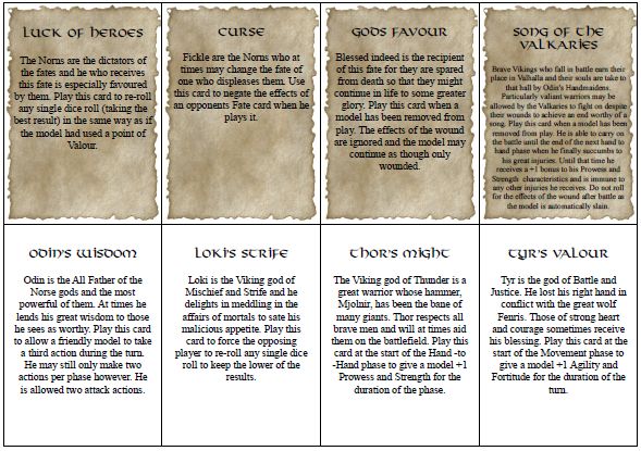
The two main questions I have are, should the face of the card have the parchment graphic? Should I use the full verbatim text to describe the card, put the effects in bold or just list the effects by themselves?
Of course any general comments and criticism would be appreciated as well as letting me know if you would prefer A4 over letter. Right now there are eight 3.5" x 2.5" cards per 8.5" x 11" sheet of paper.

I also just quickly printed these out on card stock and, except for some how feeding the sheet crooked when the backs were printed, I think they look okay.


Wow those look great! I really like the partchment behind the text it gives them a good 'Dark Age' look. I like the full text on the cards but wonder if you could somehow seperate the text and the effects on the front of the same card. I know that might be hard with the cards that have longer text. If you could do that, then what about listing the effect first on the top of the card so its easy to pick out and then the text below if people want to read it.
ReplyDeleteWhatever you decide I think they will be great and hope I can use the finished product!