Showing posts with label Flag. Show all posts

Thursday, October 10, 2013

Thoughts on Flags, ACW, Boer figures,Viking Swords and The War Game.

As you can see another post where I can't rein it in and go in depth into one topic. Perhaps I should spring for some ADD testing. My dad became convinced he has ADD, but he thought his doctor thought that he just wanted to be proscribed some kind of speed. But I digress.

Flags and or Banners

There are some great ones available on the internet, check out Ray's for example, but for some reason I have always balked because I'm not sure what size to make them. Well today I did something about it and printed out some flags from Warflag. In the printing section he gives some guides on how to print them out and scale them using various software, none of which I have of course. But what I came away with was we could take it that if 30mm is 1:60 and 25mm is 1:72 we can see that both figures give a size difference of 83%, or rather 1:72 is 83% the size of 1:60. (Hopefully this last sentence makes sense. I had a ten year old trying to get my attention the entire time I was try to write it.)
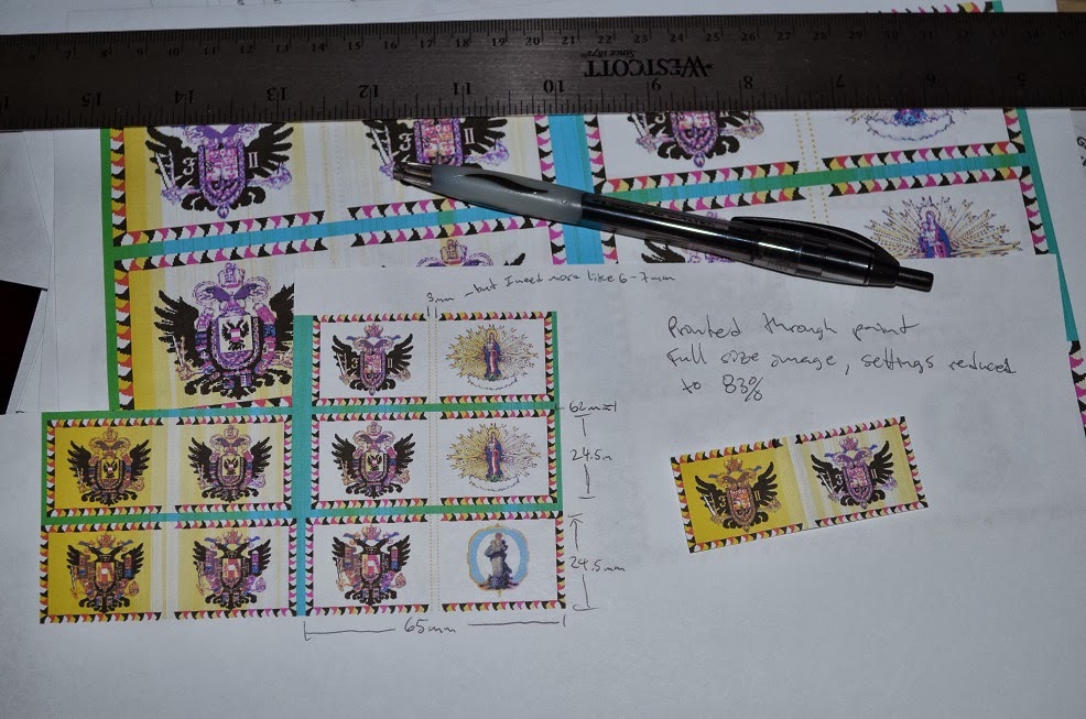
Original size and scaled with some measurement notes

Just wedged on to show scale, sorry for the anachronism.
 The space for wrapping around the banner pole is 3mm, which is fine for piano wire but I want to use tubing to slide over piano  wire so it needs to be more like 6 - 7mm. I think that will still work with the overall dimensions being 65mm across, both faces, and 24.5 mm high.

I was also bummed to see that the flags are gone from Dansk Figurspilsforening there were some good ones on there.

ACW

There's a new E-zine in town called ACW Gamer, I heard about it from Chris Stoesen here. I thought I'd give it a try. Looks good so far. I had already downloaded Pohick Church, now I have double incentive to get it ready and play it out using THW's Rifles and Rebels rule set. I'll be in touch Chris. I may also submit my two ancestors to the magazine. We'll see.

Boer figures

You ever have a set of figures you've been thinking about buying only to find that they are as rare as hens teeth now that you're ready to buy them? It was Sam in Cow-Boys Part 1 and Part 2 that showed how nice these figures work for the old west as well as colonial. But of course no one has them except this guy.

£5,000!? Not bloody likely!
Umm, you could have just said they were out of stock. FML.

Viking Swords

Watched the Nova special "Secrets of the Viking Sword" on Netflix the other day and it was pretty interesting. The PBS link is here if you want to buy it and I noticed that a few have put the whole thing up on youtube if you search for it. Aside from the guy who actually made one using what they thought were medieval techniques there were two things that interested me. First was that there were knock offs of these swords being produced and then there was an interesting demo by a swordsman who cut clean through a tatami mat, first with a samurai sword and then with an un-sharpened viking sword. Interesting. I did notice that he was cutting just the rolled up  mat, there was no dowel or bamboo in the center as there sometimes is. I wonder if that would have made a difference, I suspect so.

The War Game

I came across this game while looking at a site that carries Pegasus models and figures here in the US. You can see the game at Board Game Geek here. I think that someone said it was Axis & Allies on steroids. Has the distinction of being in the Guinness Book of World records as the largest board game ever.

Monday, December 10, 2012

Fantasy Heraldry pt. 2 - Specific design

Now we move on to the Fantasy Heraldry specific for the project I have in mind. Namely the invasion of Capalan by Tereken in the ongoing RRtK campaign over at Talomir Tales. So, just in case you're new to Talomir, Tereken are essentially Anglo-Saxons and Capalan are Italian city states around the 15th century.

As such I have to come up with one symbol for Tereken and then as many as five, one for each original province, for Capalan. Capalan also has Brethren Mercenaries so I'll have to make a Symbol for them. Tereken seems pretty straight forward. I've already identified the colors Green and Yellow and some kind of Dragon.

Dragon or Wyvern?

Capalan...hmm. Okay we know we want some kind of Italian wars theme. Looking here (particularly Mazzacane and Palma) gave me the idea to try a base scheme to tie them together with different emblems added to differentiate. So we have Resta, who is the leader, so I'm thinking skeleton or bones since google translate tells me Resta means remains. Cosimo was one of the Medici's so I will use the six circle configuration similar to that shown here. Bertolli definitely gets an olive branch if not an outright lift of the Olive Oil companies logo, probably not since that is a bad thing to do. But I'll riff off of it. Bellissima, I had thought of making her a proxy for princess peach, but then I saw a Mermaid in my collection so I think I'll go with that. And lastly Orso, the Bear. Seems like he should have a bear on his heraldry. The only question is what kind? Rampant? I wonder if there is a sleeping bear, I'll have to investigate. As far as color scheme goes I'll have to ask Ruarigh what the hex number or name is for the border highlight on his map. It appears to be some shade of violet. Could be a problem as I'm not sure what colors complement that.

From Wikimedia Commons

The bits and pieces for Capalan

Ruarigh told me what the hex # for the CC3 color was. I'm still not sure what color to pair with the purple, I'm leaning towards yellow.

Lastly the Brethren. From the RRtK rule book we read that "The Brethren have numerous holdings in Talomir called Red Castles and are found in Ekra, Altengard and Treyine."(RRtK, p66) Now as we know from reading Talomir Tales, Ekra and the Brethren have been defeated and absorbed by Treyine. So the only independent source of Brethren left is in Altengard. That being said one could make a case for the Treyine and Ekran branches hiring out as mercenaries since they have been disbanded, and their wealth reverted to the crown, by Treyine. My original thoughts were to have a central theme for the brethren, with a device to differentiate the three nations of origin. Since Ruarigh gave them the Teutonic black cross already I may stick with that, however red is the brethrens color of choice being devotees of the Red Sun. I think a cross, with a red sun in the upper left quadrant and then a device in the middle for the country. This of course may mean that I now need to make them for Ekra, Altengard and Treyine. Oh bother.

Altengard, Ekra, Treyine and a non aligned Brethren

So I did this after more correspondence with Raurigh and Javier. Okay so I phoned in Ekra, but these are all just concept drawings.

Also thanks to Iain from the THW Yahoo group for adding a link to the meaning of Heraldry symbols, aptly named Symbolism of Heraldry. I'm not sure I like it as much as at least one of the others I found, but the information looks good. Perhaps I'll do a comparison of these symbolism sites in another post.

Also as a postscript (since it's taken me days to work out this silly post) to more links of use. Color Wiki where I searched for hex codes for these oddball colors (yes I mean you Murrey).


And looking for Plantagenet herldry I stumbled upon the gold mine that is Early Blazon.

Enjoy and if you have constructive feedback I'd love to hear it.

Thursday, December 6, 2012

Fantasy Heraldry - one man's approach

When playing a fantasy campaign I like to make little heraldic icons for each nation/player. Sometimes I just go with something stock other times I try to create something new. The beauty of fantasy heraldry is that you aren't bound by convention. What follows is a walk through (or ramble) of my process and some resources I have found along the way.

I will also say that when I say heraldry I am conflating it with banners for wargaming purposes. So you want to make a banner/ heraldic symbol? What better way than to reference actual symbols. My first stop is usually Wikimedia Commons, search term Heraldry. Heraldry.ws is another good resource. For banners I like Warflag, Fanaticus, Grimsby Wargamers Society,and of course Dansk Figursspilsforening. I could go on but here are the basics.

So I now have culled through a bunch of stuff and have plenty of ideas of real or speculative designs. Next I need to think about the back ground of my Lord or nation and start throwing around the various bits that make up a heraldic device. One thing I found in researching this article is something I don't recall encountering before. There are a few sites that describe the individual meaning of the various parts of a coat of arms. The aptly named Heraldry Symbols and The Meaning Behind the Symbols - Fleur-de-lis Designs. So now I can also think about what I want to say about the individual that this CoA represents.

My method usually involves a rough sketch with colored pencils. (Please forgive my drawing, I'm a terrible artist.)

These were for my Linlandia map project.
So the since this was originally based off of a Mighty Empires campaign I was heavily influenced by Warhammer. So the Empire proxy uses the black eagle on a yellow field. The Bretonia proxy uses a yellow fleur-de-lis on a blue field. Orcs have lots of skulls, Chaos some kind of Chaos symbol. For the dwarves you need some kind of blacksmith reference and a rune, for the elves something suitably elven.

My method was to take some heraldic gifs I found out on the interwebs and use inkskape to trace them and convert them to vector images. I think I mostly made pngs because my svg file associations were weird. So by way of example, I came up with this for one of the Chaos coastal cities. I assembled the parts in GIMP, although I could have continued with Inkscape.

I kept it clear for the project

So as you can see it is chaosy with a ship to show it's status as a port. Maybe they are pirates? I don't know.

The final product made to look hand painted.
So as you can see I basically re-created the elements from my sketches using clip art. I think in this case I already had the clip art and just finagled it around.

Does this differ much from your workflow? Anyhow in the next installment I will show how I am working out  using these methods for the Talomir Tales campaign.

Thursday, July 5, 2012

Alternate Flag Ripple Tutorial

If you have tried the other method and had trouble, here's a slightly quicker and easier method.

We'll start with our base flag.

Ray's Boissleau Flag

And an image of some white material that's been ruffled up.

Ray sent me this as well.

Friday, June 15, 2012

Flag Ripples step by step

Yesterday was Flag Day here in the US, so it probably would have been more appropriate to post this yesterday. But I figured I'd put my jet lag insomnia to use and work on this today.


How I textured Ray's Boissleau Flag

  1. Open the image in GIMP (download here)
  2. I used rectangle select to crop it to one of the flags from the image.

Saturday, March 31, 2012

Flag Ripple Effect - Video Tutorial

Okay, here is my first screen cast ever and my first real tutorial for GIMP. I'm trying out the techniques I referenced in the last mention of the flag ripple technique.

Aside from looking like an idiot because I can't do simple arithmetic, I think it went okay. One thing I noticed after saving it was that I forgot to check the other two boxes on the Bump Map (Invert and Tile) But I think it looks okay. I'll also note here that with the large amounts of white in the image you can't easily keep the ripple layers with a layer mode of multiply. It darkens the image too much without adding that much to the effect, in my opinion. So that is why I only bump mapped.

My attempt to upload the video directly didn't work, so it's off to Youtube. Hmm, a total upload time of 58min? (Twiddles thumbs)


Sorry if it's a little long, but you should be able to do it after watching.

Cheers. And let me know if there is anything I can explain better.

Wednesday, March 28, 2012

How to texture a flag (for Ray) – Part 1


Now I can't seem to find the original tutorial I was looking for, but I did find this video by Jan Kardel in German on vimeo. (Doh! Put in the link to said video.)


Lets see if my two weeks of College German in 1986 and Google translate can get the job done.


(Just a clarification. The following is what he does in the video, not what I did to make the flag ripples. Although I did use a bunch of the techniques outlined.)


Just from looking at it he is starting with a default 640 x 480 pixel image. He probably set the background as transparent and then copied the background and created a new transparent layer. So we have three layers starting from the bottom. Background (BG) – copy, which looks to have the GIMP Mascot (Wilbur?) on it; BG, which has been filled with a solid color (blue of some sort); and New Layer which is transparent and the only visible layer at the start.


Off the bat he sets the New Layer Mode to Multiply. Then uses rectangle select to select an area perpendicular to the image. Then Layer > Crop to selection, Select > None. Then Filter > Render > Clouds > Solid Noise. The settings are check all the check boxes (Randomize, Turbulent, Tilable) Detail = 5, X Size = 16, Y Size = 0.7.


We now have our striped cloud layer. Now Layer > Scale Layer to increase the size. He unlocks it and stretches it to 650 wide (10px wider than the image). He then uses the Move tool to reposition it over the image. And finally Layer > Layer to image size.


Next Filter > Blur > Motion Blur. Settings: Blur Type = Linear, Length = 256, Angle = 90.


Now we make our Color BG layer visible and Bump Map it. Filter > Map > Bump Map. Settings are Bump Map = New Layer (or whatever our stretched cloud layer was called), Map Type = Linear, check all check boxes (Compensate for darkening, Invert Bump Map, Tile Bump Map), Azimuth = 135, Elevation = 55, Depth = 22.


Next he raises the Wilbur Image and runs a Filter > Map > Displacement with settings of X = 7, Y = 7, both from our “New Layer”; Displacement Mode = Cartesian, Edge Behavior = Wrap. Then Bump Map said image. All settings the same except the elevation was reduced to 53 and the depth to 14. And then the layer mode set to screen. Then the layer was duplicated which lightened its appearance.


So here is my take, modifying the techniques slightly:


I'm off to another class field trip today. I'll post the steps to do this soon. I hope this is what Ray was looking for.