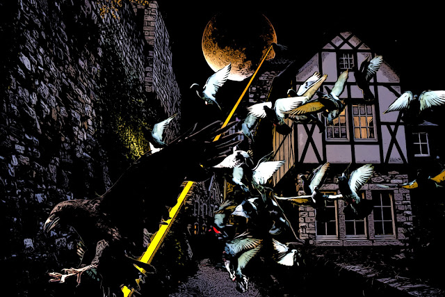
As we wrapped up our WFRP 2nd ed game on January 5th I think Brian was asking for Jason to draw the scene for the "epic" battle between Dieter in Raven form and the evil wizard's pigeon familiar. I didn't know if Jason would have time to draw it, he had done some fantastic drawings in the past, but people get busy etc. I had been wanting to learn how to do compositing in Photoshop so I thought, why not give this scene a go?
Here's what I ended up with.
To start with, I went to pixabay and searched for the images I wanted to build my composite from. after some trial and error I settled on these five.
For the purposes of this post I scaled these down and I cropped the image of the moon so it would fit. Originally all of these images were downloaded at 1920 x 1280 pixels. I then followed, a little loosely, the tutorial from the Photoshop Training Channel (PTC) on you tube. Specifically this video here:
It does a quick overview of how to mask an image, but the meat of the technique is how to match the luminosity and Hue/Saturation of the images in your composite. To be clear, I'm not totally sure I got the luminosities right and I definitely glossed over the saturation in my image. I was rushing things a little and felt like the comic treatment might hide some of the rougher areas.
Here's a screen cap of my .psd file to give you an idea. I think the video works well to explain the technique, and I'm not really in a position right now to give you a blow by blow.
The meat of the technique is in those top 5 layers. The Luminosity layer is just a Black and White adjustment layer. The idea is that it is easier to pick up the relative brightness of areas when it is reduced to black and white. The selective color layer was to help go in and adjust the saturation of the different colors in each layer to try and help them match each other. The Hue/Saturation layer was similar I think but more for matching the colors from the different images. As I write this I'm a little confused myself. The 4th level, curves, is how you actually match the luminosities. You adjust the white and black input levels until you get values that roughly match for the lightest and darkest points in each image. You could also do this with levels instead of curves. For me I think levels is a little easier because you're just moving a slider as opposed to adjusting a curve. Finally in the 5th layer you can see how I scaled the image down and masked it. I started by using the quick selection brush and used the "select subject" option to do most of the work and then went back in later and refined the selection with a regular brush and the edge detection brush later.
After I exported the the image as a jpg I ran it through my comic process that I have saved in another psd file. I just had to adjust the image size to fit this image. I probably could have spent a lot more time refining this image, saving it as a smart object, etc. But it was good enough for my needs.
Anyway, hopefully you find something useful in here for your hobby. I just thought it would be fun to try my hand and producing an image from a scene in one of our games. I have a long way to go to get better at composites, but it's a fair start. Since I can't really draw it's going to be the best I can do.
Thanks for looking.


Awesome work! Sounds like a very notable event in the campaign....or at least a really cool one.
ReplyDeleteThanks DaveB, actually it was a really short part of a battle where we got our asses handed to us and two characters died. For some reason we all locked into the "battle of the birds." Denial?
DeleteYikes. Maybe it was the sole moment of glory in an otherwise unremitting disaster?
ReplyDeleteIn true WFRP fashion it was tragi-comic. The wizard, my character, got shot out of the sky in two rounds and had to use a fate point to not die. At the time I thought he was the only one who could keep track of the item that was stolen from us. The two who died were riddled with disease, mutations and mostly insane so it was a bit of a mercy for their players that they died.
Delete