
So I downloaded the latest version of GIMP (2.8.2) here. And then did a search through Google Images for "old paper texture" there are also some nice links to old parchment, old book etc.
I chose to go with this one by nevermoregraphix from deviant art.
For the font, since it is a letter and not a book, I wanted to go with a handwritten style. As usual I went with dafont but most sites have all the same fonts. I slogged through many fonts in the handwritten section before I found one I had used before jacek zieba jasinski, it's okay but I just now did a search for Jefferson which is a nicer hand written font. But since I've already loaded GIMP without it, jacek will have to do.
So I've opened GIMP, I don't have it totally set up how I'd like but it's not too heavily modified from the vanilla install. I've only added some toolbox icons to make it more familiar to me. I've also taken advantage of the new single window feature. No more covering up menus inadvertently.

So I'm going to open my paper texture file to start as a base.

And now we have it open.

For the purposes of this tutorial I need some text, so I'm just going to use a Lorem Ipsum generator here. So I open up the text tool and type in the name of the font I want. I could scroll through but I know what I want.

And then drag a shape and paste or type the text inside it. The text tool is very different for me but I think it is improved.

You'll notice that the text is on it's own layer. So we've got a funky text on a funky background. We could stop there but it looks a little too crisp and the text overlaps that hole in the paper which we need to resolve. So we're going to try three things. We'll make a mask to make sure that nothing overlaps the hole, we'll make a copy of the text layer and apply some filters to it to make an ink bleed effect, and we'll try a bump map of the paper texture to see if we can't get it to subtly transform the text as well. So first the mask.
I chose to use the fuzzy select tool with a threshold of 70. That was close enough. I could have traced it by hand but I did not use a tablet for this tutorial.

You now have the marching ants, go to Select in the menu and save to channel.

And a quick look at the channel tab shows that it's there. I could have renamed it but chose not to.

Now I need to add this mask to my text layer. So right click on the text layer and select Add Layer Mask.

Then make sure to use your channel as a mask, choosing the right one if you have more than one, and then in this case checking the invert mask box. If you don't you will mask everything but the tiny hole. I could have fixed this by inverting my original selection, but I never seem to remember which part is the mask so I do it by trial and error.

So we've gotten rid of that tiny bit of text overlapping the hole. So what. Well it just adds to the feel of the old letter so it doesn't look as computer generated. Up to this point we've let the font itself do most of the work to make it look "more realer" (my wife hates it when I do that) so now we are going to do an ink bleed effect. This method comes from Gidde's fine tutorial over at Cartographers Guild which you can find here. The basic idea is that I am going to make three copies of my "ink" layer, whatever that may be, and then apply different filters, layer modes and opacities to each to create the desired effect. Basically that of the ink wicking into the fibers of the paper. Here are the three copied layers, made using the copy button.

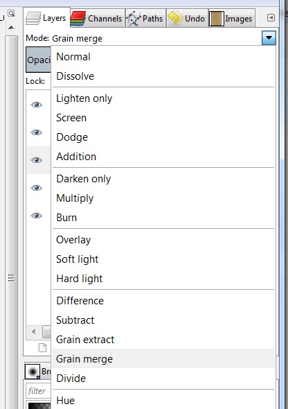
So on the first copy I set layer mode to Grain Merge.
Opacity of layer to 50%. I typed it in the box.

Then the next step is to run the filters. Here we need to take a minute to check that not only do we have the right layer selected, but that we also have the layer and not the mask active. Just click on the little image in the layer dialog and the active one will have a white border. I say this because I started running the filters on the layer mask by accident. You could also right click on the layer and hit apply mask to get rid of the separate mask, but I always like to keep things as easy to change as possible.

So on this first copy the filters are a 5px Gaussian Blur:


Then a spread noise filter of 3px.


Now go to your second copy. I'm not going to redo the pictures here, I'll just tell you what to do. Layer Mode is Grain Merge again. Opacity is now 55%. Run the Noise > Spread Filter first at 5px, and then the Blur > Gaussian Blur at 2px.
For the third copy set the Layer Mode to Multiply. Adjust the opacity to 64%.
These four layers together give a softer, almost shadow like edge around your ink. You can play with all of the above values, those are just what was written in the original tutorial.
Lastly we move on to the Bump Map. In the layers menu create a new layer, I named it Bump Map.

The next thing I had to do was open up the palette dialog. I added it to my tool bar.

I then double clicked on the Default palette so that I could select a color directly. The palette editor opened on the right near the layer menu.

I chose 50% gray then left clicked on the Fore Ground (FG) color and dragged and dropped it into my Bump Map Layer. I could have changed the fore ground color first and then selected the option to fill with FG color when making a new layer, or used the bucket fill tool.
Anyway our top layer is gray. We now go to filters and run a bump map.

Make sure that the source of your bump map is your texture image. I used the default settings for the Bump Map. ( I realize now that I covered the Azimuth and Elevation values. I believe the default is Az = 135, El = 45)

The preview shows what's going on. You should get this.

You now need to set the layer mode to Overlay. This will accentuate all the creases and wrinkles. I ended up duplicating this layer to add to the effect, as I thought it was too subtle. You could also change the settings on the bump map stage to make it more pronounced.

Here is the final product.

I left the original artist's attribution. It is fairly easy to remove, one could just crop it out for example. Thanks for sticking with it if you made it this far. Let me know if this method works for you.
I need a doctorate in something to follow that but that's why we have geniuses like you Sean!
ReplyDeleteIf I never need an old letter, I'll be in touch!
ReplyDeleteVery informative...I really am not worthy...
ReplyDelete